
Kelley Blue Book + SCAD Pro
Kelley Blue Book, a company entering its 100th year of existence, is a brand built on trust, knowledge, and customer care. To celebrate their 100 year anniversary, the KBB team came to SCAD for a brand refresh, and a campaign made for Gen-Z, by Gen-Z.
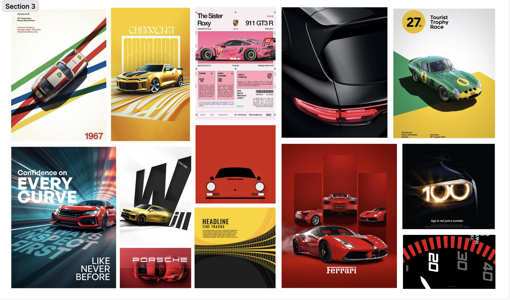
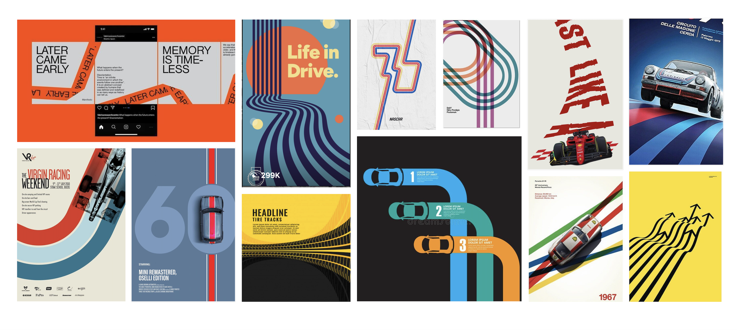
These boards focus on extending their existing style while highlighting Kelley Blue Book’s iconic branding pieces. The line represents the road and ribbon, tire marks which are repeated from the end of the KBB ribbon. Close up on car features to show data and details of the vehicles
Iconically Inspired.
I was in charge of curating, executing, and maintaining the campaign’s visual identity.
About 45% of Gen Z don’t know what Kelley Blue Book to what service they offer, so I pulled design details from what they’re all about. The cars, the roads, and 100 years of trust.
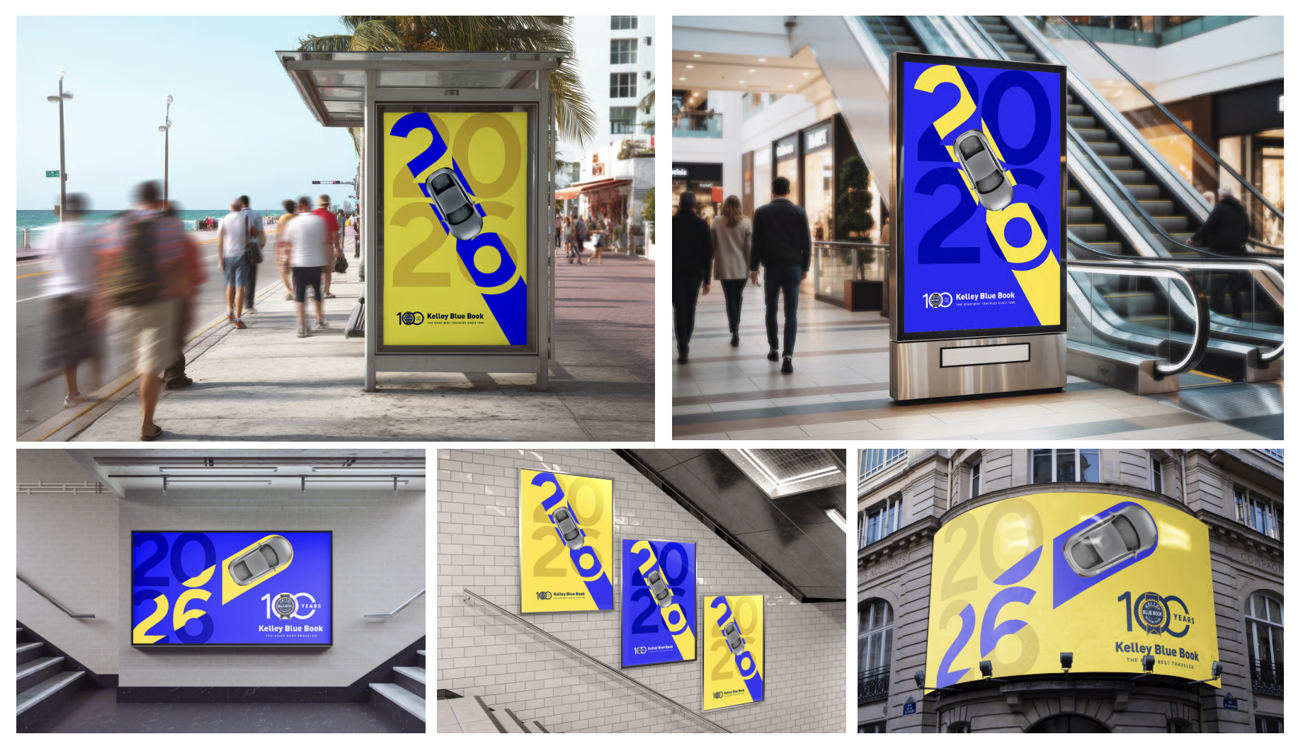
For motion, particular attention was focused on how car brands communicate with consumers. I wanted us to be apart of the conversation and use a language that is familiar. The goal was to create sleek motion and clean designs that can exist on websites, OOH, and social media.
Simple & Clean
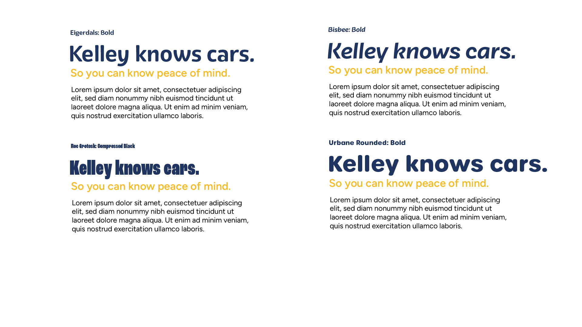
Because of the KBB’s history, I ended up setting on a type face that is both legible and timeless. Perfect for the lifetime Kelley Blue Book users and new users alike.
Testing Type
In these type explorations, I wanted to work with a type that would appeal to Gen Z. Something fun, round, and approachable.
Type in Motion
The added motion to type was made for social media posts and digital ads. It is designed to be eye catching and legible.
Out of Home
Social Media

See the Execution
A team of 19 students, across Advertising, Motion Design, Industrial Design, Graphic Design, User Experience, and Marketing came together to create a campaign that would set Kelley Blue Book up for success for their 100 year celebration. To view the project in its entirety check out the site made specifically for the launch.